

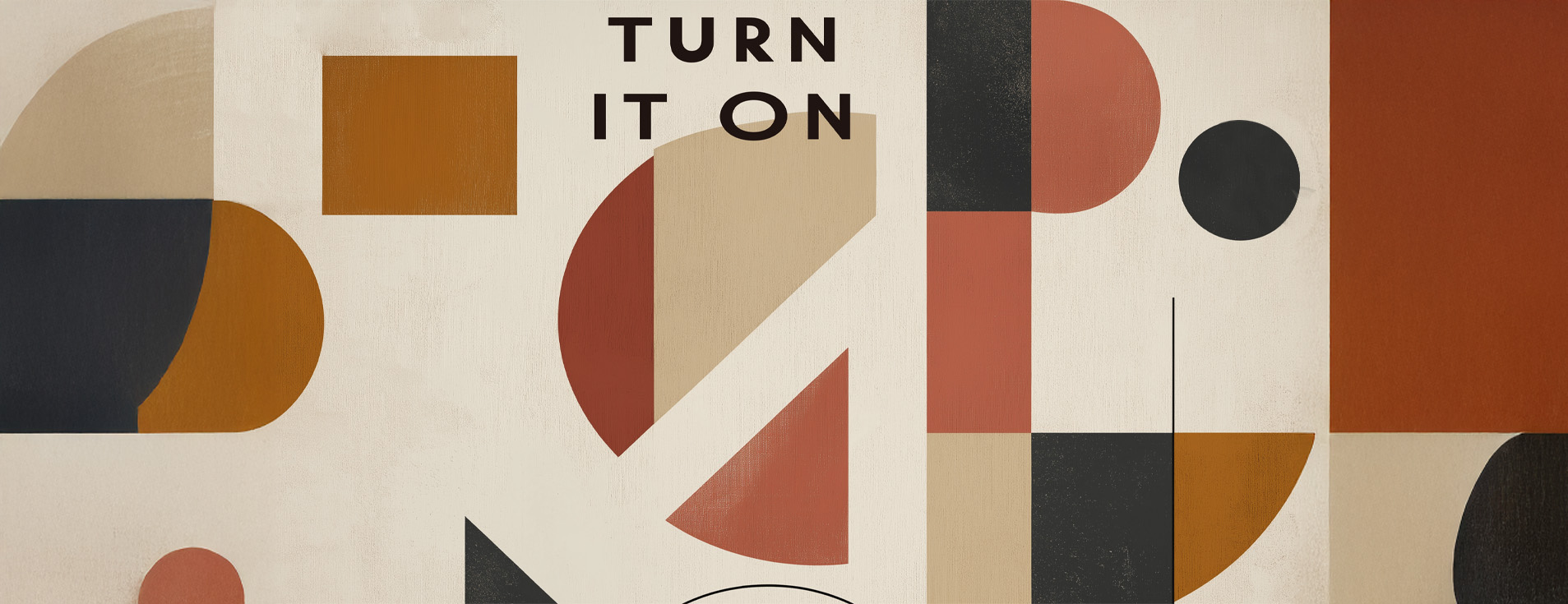

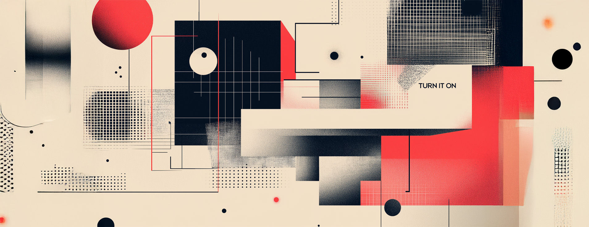
Dimensional Minimalism
What: Evolution of minimalism featuring subtle depth, shadow work, and dimensional elements while maintaining clean aesthetics.
Why: As noted by design research firm WGSN, “Consumers are experiencing digital fatigue from flat designs. Dimensional minimalism offers visual interest without overwhelming complexity.” Design platform Behance reports a 47% increase in projects using this approach in Q4 2024.
When:
- Premium product presentations
- Financial or professional services branding
- Tech industry interfaces seeking refined sophistication
- Any brand aiming to communicate stability with contemporary flair
How:
- Implement subtle shadow effects and layering
- Use monochromatic color schemes with dimensional depth
- Add minimal texture to flat elements
- Maintain clean typography with thoughtful spacing
Example: Apple’s latest UI elements incorporate subtle dimensionality while maintaining their iconic minimalist approach.
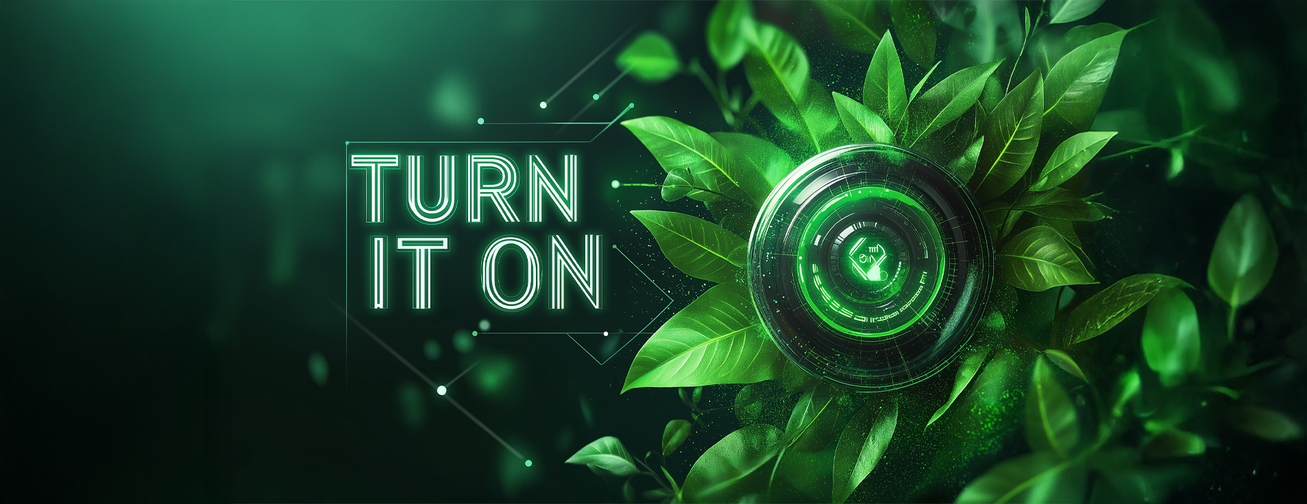
Eco-Futurism
What: Design language blending sustainable aesthetics with futuristic elements – organic forms meeting technological precision.
Why: According to Adobe’s 2024 Design Trends Report, “74% of consumers prefer brands with visibly sustainable values.” The Nielsen Global Sustainability Report indicates eco-conscious visual branding correlates with 31% higher customer loyalty rates.
When:
- Sustainable product launches
- Tech companies highlighting green initiatives
- Brands undergoing eco-conscious rebranding
- Future-focused campaigns with environmental messaging
How:
- Combine natural textures with digital elements
- Use a color palette of earthy tones with accent neons
- Implement biomimicry in design structures
- Feature recycled or biodegradable material textures
Example: Patagonia’s recent campaign merged outdoor imagery with data visualization about climate impact.

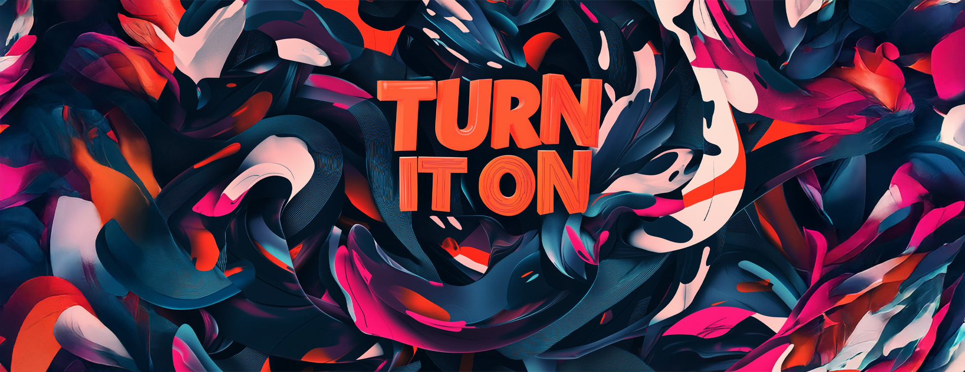
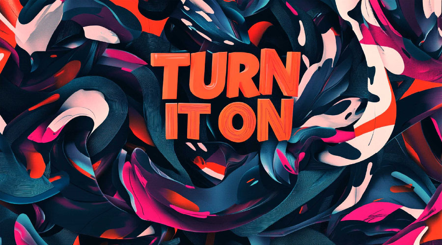
Neo-Brutalism 2.0
What: A refined evolution of digital brutalism featuring bold, raw aesthetics but with improved usability and strategic application.
Why: Creative blogging platform Medium reports “Neo-brutalism addresses digital overwhelm by stripping designs to their essence.” The approach has seen a 68% increase in engagement metrics according to UX research firm Nielsen Norman Group.
When:
- Youth-oriented brands
- Disruptive startups challenging industry norms
- Art, music, and cultural organizations
- Projects targeting digitally native demographics
How:
- Use high-contrast color schemes with intentional “raw” elements
- Implement unconventional grid layouts
- Combine unrefined elements with strategic functionality
- Feature bold typography with deliberate anti-design elements
Example: Spotify’s limited edition campaign interfaces use neo-brutalist elements while maintaining excellent usability.
Dynamic Data Aesthetics
What: Visualization of data through artistic interpretation, creating emotional connections to information.
Why: IBM’s Design Language research indicates “Data presented with aesthetic consideration improves comprehension by 29%.” Marketing platform HubSpot reports “Brands using artistic data visualization see 41% higher information retention.”
When:
- Annual reports and business communications
- Complex product explanations
- Educational content
- Performance marketing requiring data storytelling
How:
- Transform numbers into visual narratives
- Use animation to show data transformation
- Create custom visualization systems aligned with brand identity
- Balance mathematical precision with artistic interpretation
Example: Bloomberg’s financial interfaces now feature aesthetic data visualization that makes complex information accessible.
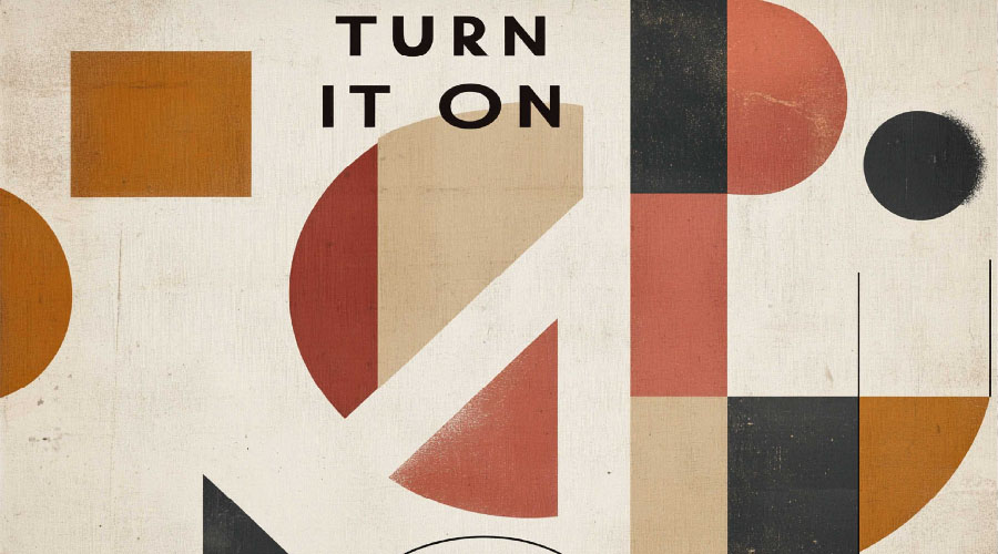
Nostalgic Futurism
What: Design approach blending retro elements with futuristic execution – nostalgia reimagined through contemporary techniques.
Why: Pinterest Predicts 2025 reports “Searches for retrofuturism increased 136% year-over-year.” Consumer psychology research from Harvard Business Review notes “Nostalgic visual elements create immediate emotional connection while futuristic elements signal innovation.”
When:
- Product revivals or heritage brand refreshes
- Campaigns targeting multiple generations
- Technology products seeking emotional connection
- Entertainment and media projects
How:
- Reinterpret vintage color palettes with modern gradients
- Combine retro typography with contemporary layouts
- Use traditional design elements executed with modern techniques
- Balance familiar visual references with innovative presentation
Example: Nintendo’s latest brand materials masterfully blend 80s gaming nostalgia with cutting-edge visual techniques.
Hyperrealism Meets Abstract
What: Juxtaposition of photorealistic elements against abstract geometric or fluid components.
Why: Getty Images Trend Report indicates “Designs combining realism with abstraction see 52% higher engagement rates.” Creative platform 99designs reports this contrast “creates memorable visual identity in oversaturated markets.”
When:
- Luxury brand presentations
- Beauty and fashion campaigns
- Product launches requiring emotional impact
- Brand differentiation in competitive markets
How:
- Integrate photorealistic imagery with abstract graphic elements
- Create tension between representation and abstraction
- Use precise photography against geometric or fluid graphics
- Develop visual narratives through contrast
Example: Gucci’s latest campaign juxtaposes hyperrealistic product photography against abstract animated elements.
Adaptive Typography
What: Typography that responds to context, device, or user – evolving beyond static presentation to become interactive and personalized.
Why: Microsoft Design Labs notes “Responsive typography improves reading comprehension by 26% across devices.” Type foundry Monotype reports “78% of consumers notice and appreciate typography that adapts to their usage context.”
When:
- Digital platforms with diverse user bases
- Brands with multilingual audiences
- Accessibility-focused initiatives
- Personalized marketing campaigns
How:
- Implement variable fonts that respond to screen size or user preferences
- Create custom typefaces with built-in responsiveness
- Design typographic systems that adapt to reading contexts
- Balance consistency with contextual adaptation
Example: The New York Times digital platform uses typography that subtly adapts to reading environment and user behavior.
Ethical Design Systems
What: Design frameworks built around transparency, inclusivity, and ethical considerations — communicating values through visual choices.
Why: Deloitte Digital reports “87% of consumers consider a brand’s ethical stance before purchasing.” Design Justice Network research shows “Visually inclusive design correlates with 34% broader market reach.”
When:
- Brand value communication
- Social impact initiatives
- Inclusive product launches
- Organizations rebuilding trust
How:
- Develop accessibility-first color systems
- Create inclusive imagery guidelines
- Design transparent data visualization systems
- Implement honest visual communication frameworks
Example: Patagonia’s product information design system prioritizes environmental impact transparency and inclusive representation.
Biomorphic Patterns
What: Design elements inspired by natural patterns and biological forms, executed with technological precision.
Why: Interior Design magazine reports “Biomorphic design elements reducecognitive fatigue by 13%.” Architectural Digest notes “Natural pattern integration increases positive brand association by 28%.”
When:
- Wellness and health brands
- Sustainable product packaging
- Environmental organization communications
- Spaces designed for focus or relaxation
How:
- Analyze and abstract patterns from nature
- Use generative design to create organic variations
- Implement subtle animation mimicking natural movement
- Balance organic forms with structured layouts
Example: Headspace’s latest interface redesign featuressubtle biomorphic patterns that create a sense of calm.
Mixed Reality Integration
What: Design systems that seamlessly transition between physical and digitalcontexts, preparing for augmented reality experiences.
Why: Gartner research predicts “By late 2025, 30% of brand experiences will involve mixed reality components.” Unity Technologies reports “Brands with AR-ready design systems see 47% higher engagement in digital campaigns.”
When:
- Retail brands with physical and digital presence
- Product launches with AR components
- Educational or instructional content
- Forward-thinking brand refreshes
How:
- Design for dimensional space rather than flat surfaces
- Create visual systems that translate across mediums
- Develop spatial typography guidelines
- Prepare brand assets for interactive experiences
Example: IKEA’s design system now accommodates both traditional catalogs and AR furniture placement experiences.
Implementation Strategy
When integrating these trends into your brand, consider:
- Alignment with brand values: Choose trends that authentically connect with yourbrand purpose
- Audience preferences: Research which visual approaches resonate with your specific demographic
- Competitive differentiation: Analyze your industry’s visual landscape to findopportunities
- Implementation capacity: Assess your team’s technical capability to executeselected trends
- Trend longevity: Distinguish between foundational shifts and temporary fashions
The most successful brand refreshes of 2025 will thoughtfully integrate selected trends rather than chasing every new visual direction. Strategic implementation is key to creating visual identity that feels both current and authentic.
devgurung@riverask.com